PROJECT AT A GLANCE
The token system that anticipated multi-brand.
In 2021 we were laying the foundations of a design system from scratch for a global healthcare platform. An uncomfortable question, asked at the right moment, changed everything. This is the story of why that question deserved an architectural answer, not a patch.
PROJECT AT A GLANCE
Role
Design System Lead · Token architecture
Domain
Healthcare · Multi-brand · Multi-product
Year
2021, before multi-brand was common practice
Scope
Token architecture · Semantic naming · Cross-brand theming
Focus
Long-term thinking · Scaling without technical debt
THE QUESTION THAT CHANGED EVERYTHING
"What happens if the company changes its brand colour tomorrow?"
The moment
In early 2021, we were building the foundations of a design system from scratch: foundations, tokens, naming, the basics any system needs. While we worked, one question kept coming back, to me and to the developer I worked with. It sounded simple.
What happens if the company changes its brand colour tomorrow? If we stop being blue and become red, how much of the system breaks?
The honest answer
At the time, the honest answer was: a lot. That question became the start of a decision that would change the direction of everything we did next.
It also told us something important. If one question could break the system, the system was not ready yet. This was bigger than a component library with a colour painted on top. Without fully seeing it, we were standing in front of the first real question of any multi-brand system.
The context
In 2021, multi-brand was not a common topic in design systems. The frameworks, the references, the case studies you see everywhere now did not exist. There was no path to follow.
There was a hard question, and the feeling that it deserved a serious answer.
THE DECISION: NAME TOKENS BY THEIR JOB, NOT THEIR LOOK
A token would no longer represent just a visual value. It would represent a role, a purpose inside the system.
The normal way to name a token is by how it looks. color-blue-500. font-size-16. It works, until something changes. And something always changes.
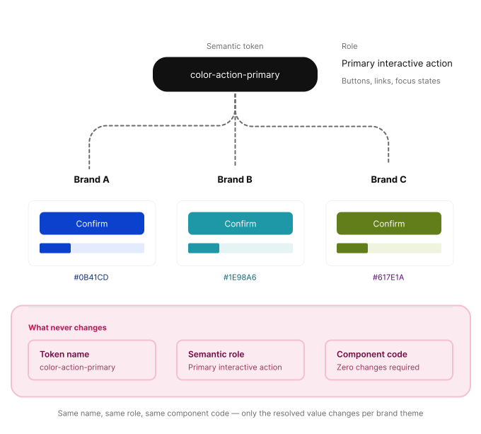
So we changed the logic. A token would not stand for a colour or a value any more. It would stand for a job, a purpose inside the system. color-action-primary is not blue. It is the colour that means "the main action on this screen", whatever colour the brand picks: blue, red or green.
Semantic token
color-action-primaryIt's not "blue". It's "the colour that communicates the main action on this screen, whatever blue, red, or green the brand decides to use".
On paper, this looks like a small change. In practice, it is what lets everything else scale. It means the same component, with the same code, untouched, can wear any brand the company needs tomorrow.
The token system became the single source of truth shared by design and development. It could move to different brand assets and different programming languages, and no one had to rewrite anything.
This is what it looks like when one token is used in three brands. Same name. Same job. Same component. Only the final value changes.
"Same name. Same job. Same component. Only the final value changes."
WHY WE DID IT ON PURPOSE
"With no old system to protect, this was the only moment when we could build the right base with no technical debt behind us."
The easy reading
You might think this was only possible because nothing was built yet, so starting clean was easy. But that misses the point.
The reality
We saw something many companies miss until it is too late. With no old system to protect, this was the only moment when we could build the right base with no technical debt behind us.
The cost of waiting
Once a system grows without that base, adding semantic tokens later means months of work on hundreds of components, with a real risk of breaking live products.
We saw the window and we used it. This was not luck. We knew a hard question needed a real answer in the architecture, not a quick fix.
THE IMPACT
When the cost of putting a new brand on a product drops to almost nothing, you do more than speed up design. You give the company a new power.
A note on impact
I do not have exact numbers I can share, and I prefer to be honest about that than give a number that only sounds good. But I watched how the system was used afterwards, and this is what I can say.
Before we had a shared token framework, putting the product in a new brand meant starting again from almost zero. Every new product and every new brand was a full design and development project.
The transformation
With semantic tokens in place, that same work became a matter of changing values, not rebuilding the whole experience. Planning got shorter. Building went from a project to a setup.
This gave the business something it never had before: a real way to test, validate and launch in new markets, or with new partners, at a speed that was not possible before. You give the company a new power: the power to say yes to chances that used to be too expensive to even consider.
BEYOND PHARMA
Because a token names a job instead of a look, it works in any industry that needs one product to run under different brands.
This system started in healthcare, but the architecture has nothing that only works for pharma. Think of a fintech with several white-label neobanks on the same base. A productivity tool that takes the look of each company that uses it. An education platform that adapts to every school that licenses it. In every case the question is the same one we asked in 2021: what happens if the brand changes? And the answer is the same: nothing, if the system was built the right way from the start.
Fintech
A fintech with several white-label neobanks on the same base.
Productivity tool
A productivity tool that takes the look of each company that uses it.
EdTech
An education platform that adapts to every school that licenses it.
"We did not solve a Roche problem. We solved a systems problem, and Roche was simply where we got to ask it first."