This case belongs to the same healthcare and diabetes ecosystem as Case 01. Under confidentiality agreement, we cannot name the client or show real screens. What is shown here describes the problem, the reasoning, and the decisions as they happened. If you want the full detail, let's talk.
THE PROJECT AT A GLANCE
THE PROBLEM
Having all the data does not mean understanding it.
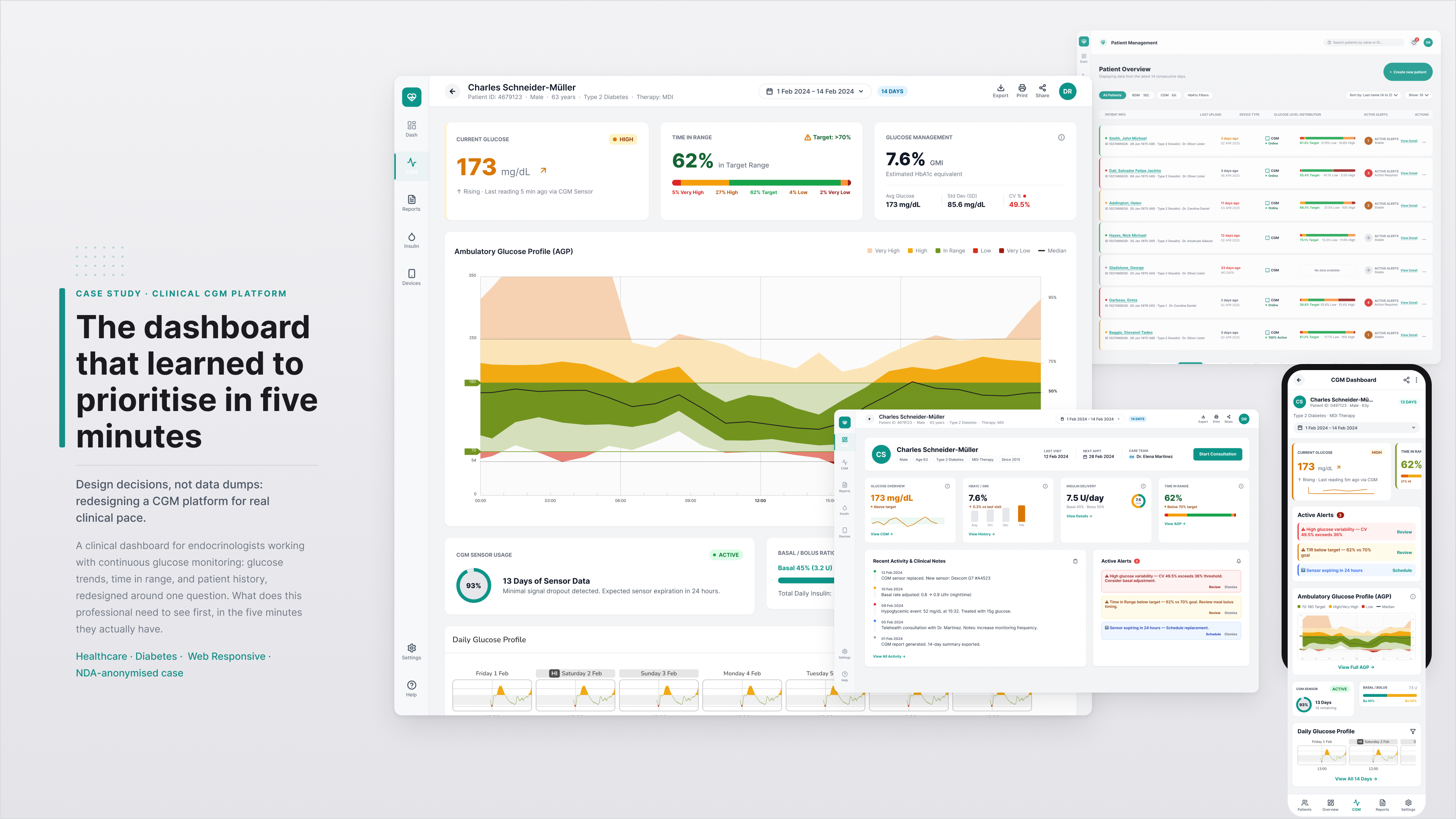
HCP Client is the tool a healthcare professional opens to see how a patient with diabetes is doing. HbA1c, CGM, BG, glucose spikes, and all the daily context that explains those numbers: meals, exercise, other events. The amount of data was not the problem. The problem was that having all that data does not mean understanding it in the short time of a real consultation.
We could build a technically complete product and still leave the professional not knowing where to look first. That was the easy trap: mistaking data coverage for clarity.
We were not designing for one person. HCP Client lived inside an ecosystem with healthcare professionals reading that data, patients whose care depended on accurate records, the team creating and editing patient records, other product teams building on the same base, and different brands needing the same solution with different identities. Optimising for one of these groups at the expense of the others would have been easier and cheaper. It would also have been wrong.
FROM VISUALISING DATA TO PRIORITISING DECISIONS
What does this person need to decide, and what do they need to see to decide it?
Our first instinct would have been to ask: how do we show this data? We changed it to a different question: what does this person need to decide, and what do they need to see to decide it?
The difference matters. A dashboard that shows everything is a dashboard that helps no one get to what matters faster. The design goal became a sequence of questions the system had to answer in order: what is happening, where should I look, what pattern explains this, what context do I need to interpret it.
For the healthcare professional, the goal was never to see more data. It was to understand the data they already had in front of them, with room to explore more depth only when they needed it.
FOUR DECISIONS THAT SHAPED THE DESIGN
Four decisions that shaped the design.
Not all decisions carry the same weight. These four shaped the product more than the rest.
01
Prioritise before adding.
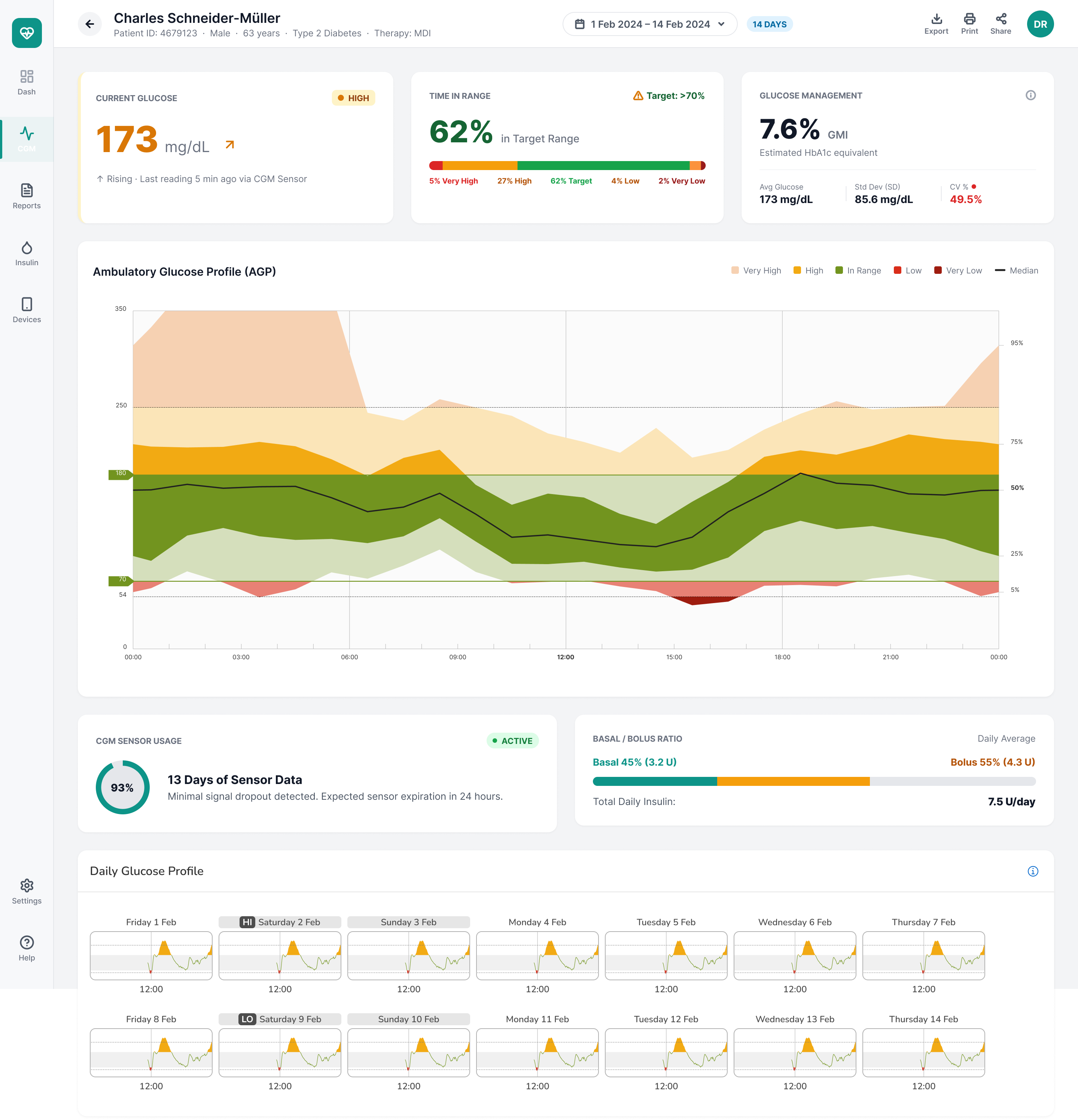
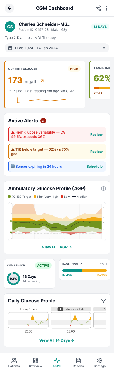
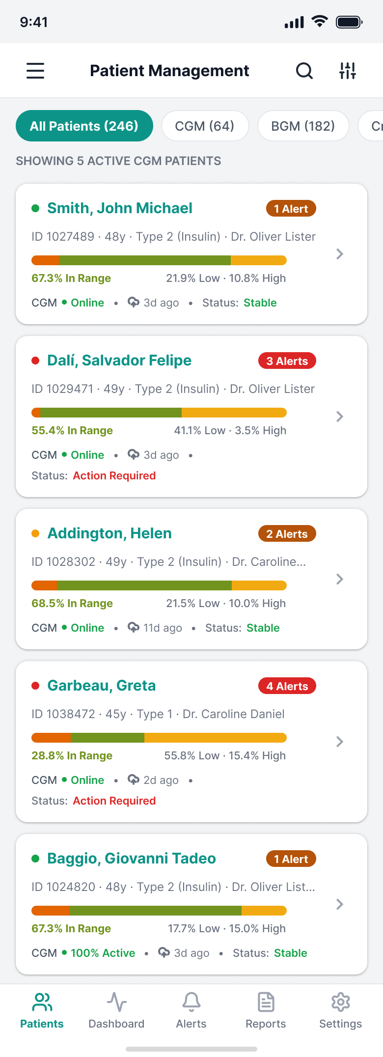
Not all information carries the same weight. Before deciding how to show a piece of data, we decided whether it belonged in the first read or a level below. That discipline, applied consistently, is what separates a useful clinical dashboard from one that only looks complete.
02
Add context instead of isolating data.
A glucose spike without context is just a number. The same spike, connected to the meal or exercise that came before it, is an explanation. We designed clinical values to always sit next to the daily behaviour around them, not as separate layers the professional had to cross-reference in their head.
03
Design states, not just screens.
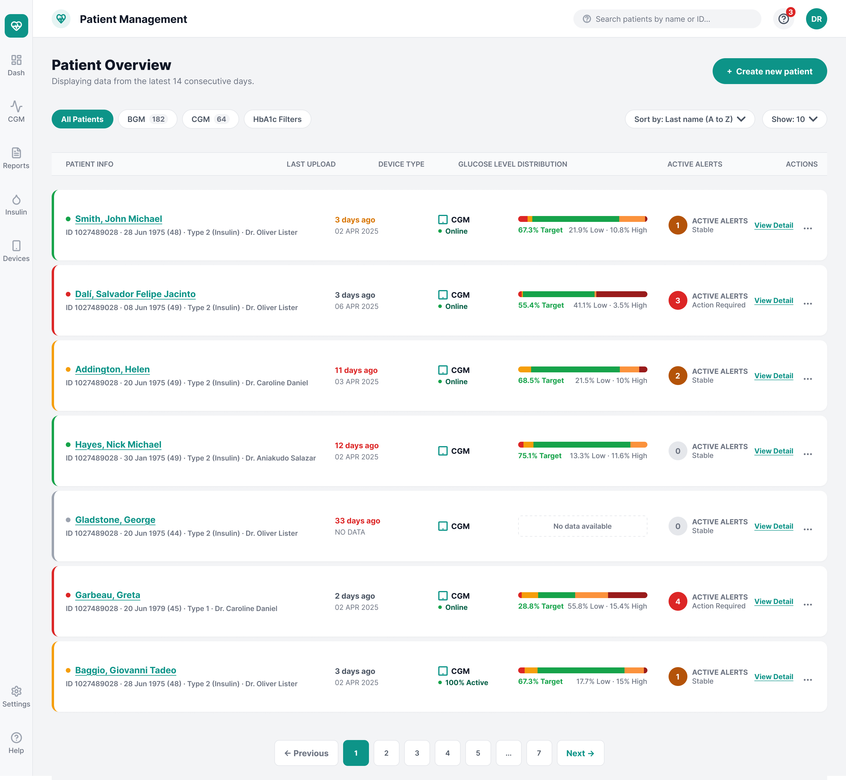
Loading, empty, error, editing, confirmation, no data: each one is a product decision, not a technical detail to solve later. This became especially critical in patient creation and patient edition, where a poorly designed state is not just a bad experience, it is a risk to sensitive data.
04
Patterns before exceptions.
Every new solution went through the same question: does this strengthen the system, or does it create one more exception to maintain? A well-solved patient creation flow revealed needs that repeated across forms, validation, and feedback elsewhere in the product. Those decisions fed back into the Case 01 design system, and from there reached other teams. The cycle ran in both directions: the product fed the system, and the system fed the product back.
VALIDATION WAS NOT A FINAL STEP
Risk had to be reduced at every layer, not just at the end.
In a clinical product, waiting until the final usability test to discover that the hierarchy does not work is expensive. Risk had to be reduced at every layer, not just at the end.
Before validating a screen, we validated the problem: does this answer a real need in the clinical workflow, or does it just add information because we had it available? Before validating the interaction, we validated the architecture: does the hierarchy let people find the most relevant thing first? And before calling any solution good, we asked whether the pattern only worked on that one screen, or whether it could hold up across the rest of the ecosystem without another team having to reinvent it.
We would rather be transparent about this: we are not going to quote a usability test number or a sample size we cannot document. What we can defend is the validation model itself, and how it changed the way the team made decisions before a single line of code was written.
RESULTS
The structural change.
We do not have figures we can share under NDA, and we would rather say that clearly than give a number that just sounds good.
What we can defend is the structural change. HCP Client stopped being designed screen by screen and started being designed as part of a system with shared rules: the same hierarchy criteria, the same state patterns, the same logic for adding context, available to any team building on the same base. Patient creation and patient edition, once among the most ambiguous flows in the ecosystem, gained validation and states consistent with the rest of the product.
A healthcare professional with five minutes for a consultation needs the system to do part of the prioritising for them. That was always the real measure of success, even if it did not fit into a number.
WHAT THIS PROJECT SHOWS
The responsibility does not end when the flow works in Figma.
This case sums up something we treat as a principle, not an exception: the design team's responsibility does not end when the flow works in Figma. It ends when we understand what decision the person on the other side needs to make, what constraints the business has, what engineering can maintain, and which part of the solution deserves to become reusable infrastructure for the rest of the ecosystem.
In HCP Client, that question repeated at every layer: product, interaction, system. The answer was always the same.
A complex system becomes understandable when someone consciously decides where the complexity goes, and where it does not.