THE PROJECT AT A GLANCE
Role
UX / UI Product Designer (alongside a Design Lead)
Domain
Banking · Mobile · Financial aggregation
Year
2019–2020
Scope
End-to-end flow, system states, UI design (iOS and Android)
Team
Product, Engineering, Research, Business
Focus
Trust, clarity, system complexity
THE PROBLEM
The real barrier was not technical. It was trust.
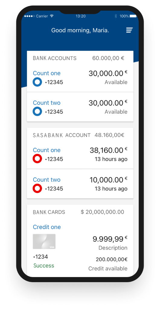
People kept their money across several banks. To see the full picture, they had to open one app, then another, remember a different password each time, and add it all up in their head.
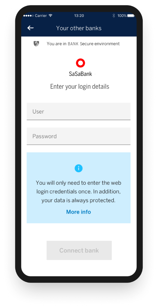
The Bank wanted to bring those outside accounts into one place. It sounded like a technical integration. It was not. The real barrier was trust. Asking someone to type one bank's password inside another bank's app touches the most sensitive nerve in finance.
The problem had three faces. The information was scattered. The switching between apps was tiring. And underneath both sat the hard one: sharing another bank's credentials made people anxious. Our job was not to connect systems. It was to make a sensitive process feel safe.
MY ROLE
UX/UI Product Designer, working with a Design Lead.
I was the UX/UI Product Designer, working with a Design Lead. We set the strategy together with business and engineering. A dedicated Research team ran the studies, and we took part and reviewed the findings with them.
My part was the information architecture, the flow from first discovery to daily use, the UI aligned with the bank's design system, and the edge cases: the errors, the failed validations and the odd states where a financial product earns or loses trust.
WHAT RESEARCH TOLD US
People wanted the feature. The friction was in the experience.
People wanted the feature right away. The idea of seeing every bank in one place was easy to grasp. The friction was in the experience.
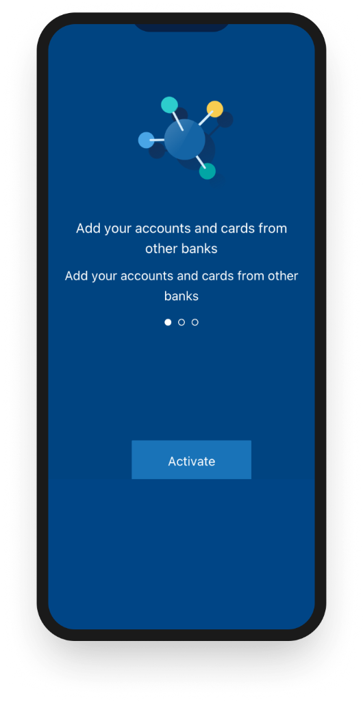
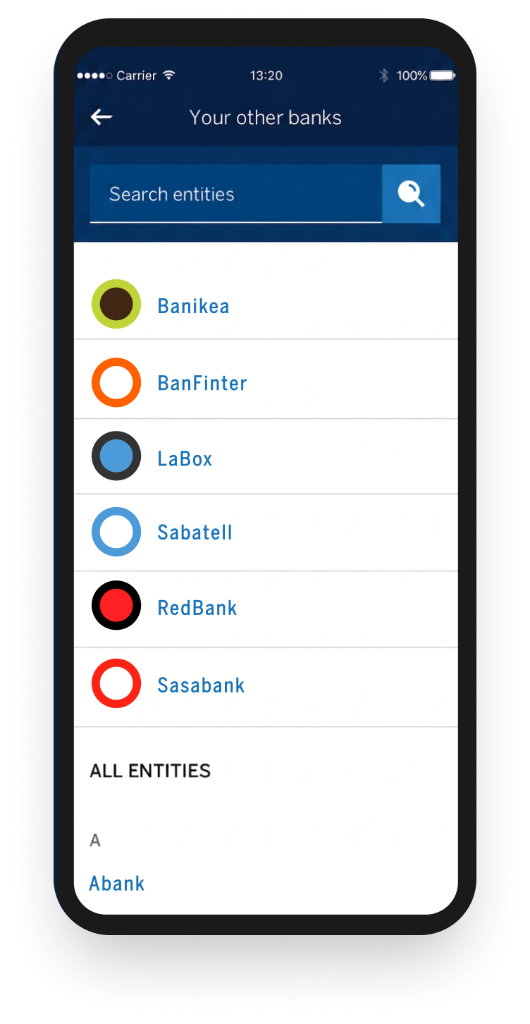
Three findings set the direction. Entry points were hard to spot, so people did not know where to start. Trust had to be earned before anyone would move forward. And the second bank was where it broke: after the first connection, the flow stopped feeling clear.
THE FLOW, SCREEN BY SCREEN
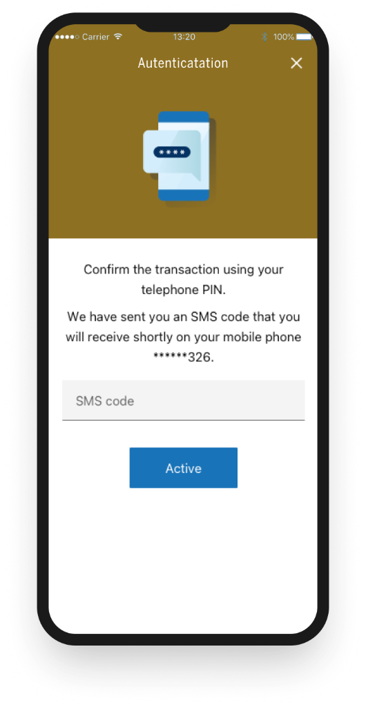
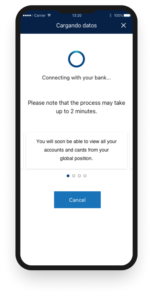
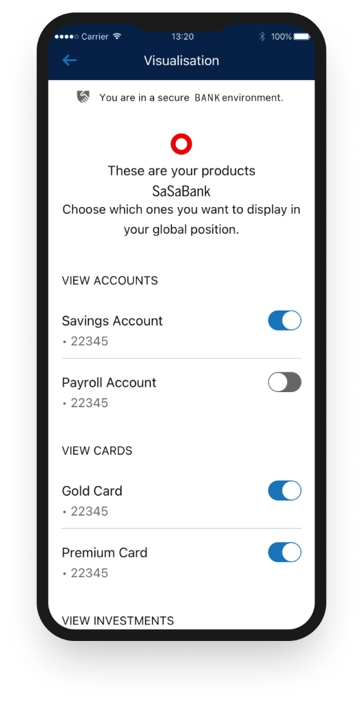
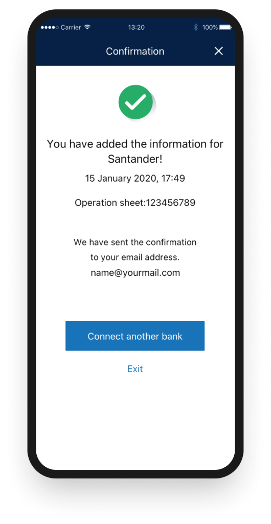
THE DECISIONS THAT MATTERED
Many choices shaped this project. These three mattered most.
Many choices shaped this project. These three mattered most.
01
One screen, one decision, one next step.
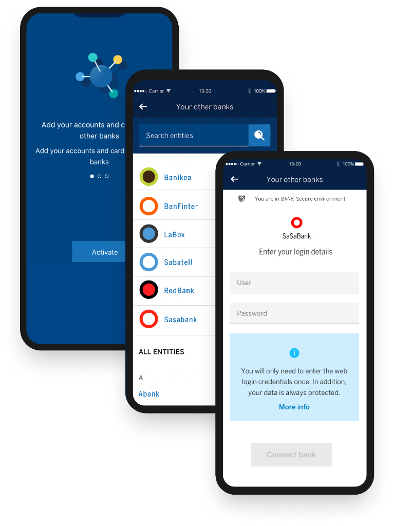
A sensitive flow is the worst place to show everything at once. With the Design Lead, business and engineering, we split it into small steps. Each screen asked one question and one action, and the copy made the next move obvious. The complexity was still there, but people never had to hold all of it at once. That is what progressive disclosure is for: not hiding the hard parts, but releasing them at a pace a nervous user can follow.
02
Copy as a trust tool, not decoration.
Typing another bank's password is the moment of most doubt, so the words had to reassure, not just inform. We rewrote the microcopy to sound human, not technical: you are inside a secure environment, your data stays protected, this only happens once. The reassurance sat right where the doubt was, not buried in a help page. The same calm tone ran through the whole flow.
03
Loading states that explain, not just spin.
The connection could take time, and silence makes people nervous about their money. So the waiting screens did more than show progress. The team made them say what was happening and what to expect, which kept people calm while they waited.
TWO MORE CHOICES
Two more choices backed these up. Clear entry points brought the feature in at the right moment, like a visible card in the main account view, without crowding regular users. And people could choose which accounts and products showed in their dashboard, so more banks never meant more clutter.
Choose what to see.
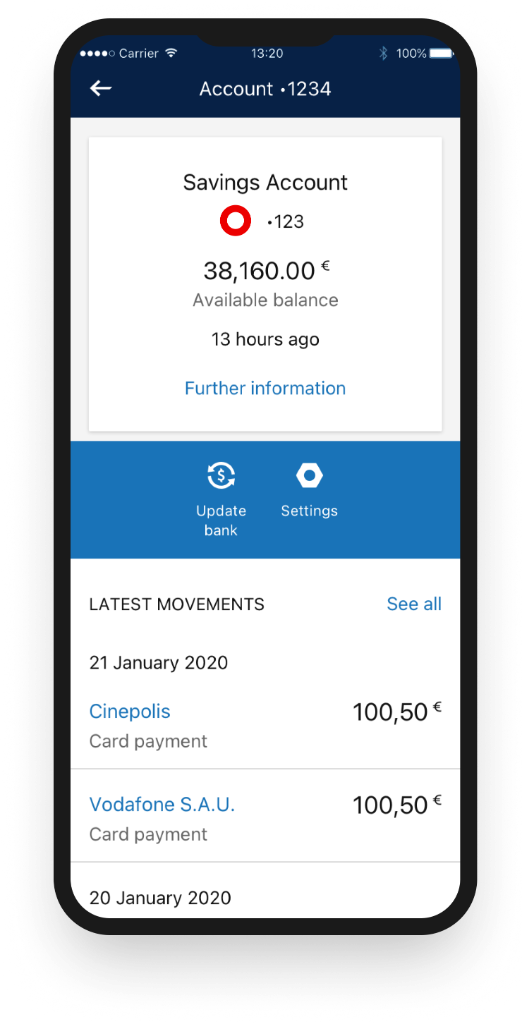
People could choose which accounts and products showed in their dashboard, so more banks never meant more clutter. The product visualisation screens below show how aggregation and product selection worked together in the final UI.
THE OUTCOME
The guided approach held up.
In usability testing, the guided approach held up. Task completion reached 87%. Trust perception, which we measured on purpose because it was the real goal, averaged 4.5 out of 5. And 92% would recommend it.
The results matched what research had hinted. People preferred the step-by-step path over one dense screen. Clearer grouping and labels let them move without help. And calm, honest security messaging built the confidence that carried the rest.
Task completion
Trust perception (out of 5)
Would recommend
Unified Financial Dashboard
All accounts from multiple banks in one comprehensive view
One view. Complete control. All your financial information, secure and accessible.
WHAT I TOOK FROM IT
Turning trust, waiting time and system complexity into confidence.
In fintech, good UX is not only about clarity. It is about turning trust, waiting time and system complexity into confidence.
Three lessons stayed with me. Progressive disclosure lowers anxiety, so you guide people one step at a time. Security messaging should be clear but never scary, which is a balance of reassurance and honesty. And the edge cases and error states are where the real experience lives, so they separate good work from great.
01
Progressive disclosure lowers anxiety
Guide people one step at a time.
02
Security messaging: clear but never scary
A balance of reassurance and honesty.
03
Edge cases are where the real experience lives
They separate good work from great.
Designing for money asks for a rare mix: precision, empathy, and care for the moments where people feel most exposed.
Some details are under NDA. I'm happy to walk through the full process and decisions in a conversation.