CASE 01
Design System as Infrastructure.
In diabetes care, the interface is not decoration. It is how a healthcare professional reads the data, makes a decision, and sees how much time is left in the appointment with the patient (usually about five minutes). When that interface is inconsistent, broken up or hard to predict, it slows the read, clouds the decision, and takes time the patient may not have.
CASE AT A GLANCE
Role
Design System Lead · Senior Product Designer
Domain
Healthcare · Diabetes care
Scope
Foundations · Components · Tokens · Governance · Adoption
Tools
Figma · Zeroheight · Storybook · Design tokens
Focus
Design maturity · Scalability · Cross-platform consistency
MY ROLE
For the first 18 months I was the only designer on the team.
One developer to my left through a screen, another to my right through another screen, and a whole set of products waiting for the system to work. There was no manual for that. I had to build the foundation, defend every important decision to stakeholders who did not always see the point, and keep product teams moving, all at once.
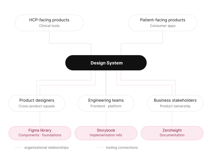
My job was to create the conditions for good design decisions to repeat on their own, without depending on me being in every conversation. That meant foundations, tokens, component architecture, documentation, governance, the move from Sketch to Figma, and an adoption plan that made teams want to use the system.
MY ROLE
The team grew over time, from one designer and two developers to three designers and four developers, with iOS and Android added later.
But through the hardest build period, the whole design side rested on one person. That taught me something no book does: a system stands on the trust you build around it as much as on its architecture, and on having managers who back you when the decisions are hard.
FOUR DECISIONS THAT SHAPED THE SYSTEM
There were many decisions across the project. These four set the direction for everything else.
I started with foundations, not components.
The easy option was obvious: ship a component library fast to show progress and build confidence. I turned it down. In a broken-up environment, starting with components would have copied the mess we already had instead of fixing it. We needed a common language first: colour, typography, spacing, grid, tokens, accessibility. Without that base, components are pretty objects with no grammar. With it, every component belongs to something larger.
I treated the responsive grid as an infrastructure decision.
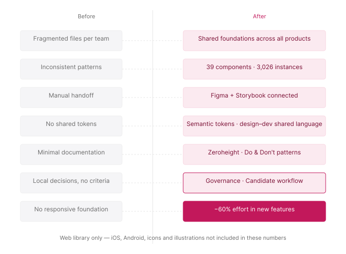
Some stakeholders did not see the need; the products ran mostly on desktop, so why invest in responsive? I changed the question. Forget mobile for a moment: did we want to keep solving layouts screen by screen for the next five years, or build a base that could adapt? Once it shipped, the grid cut time and effort on new features by more than 60% across design, development and testing. It also opened the door to LTR/RTL support for Latin, Cyrillic, Arabic and Asian languages, to real accessibility criteria, and to a clear business chance: entering new markets. What looked like a technical decision was really a cultural and strategic one.
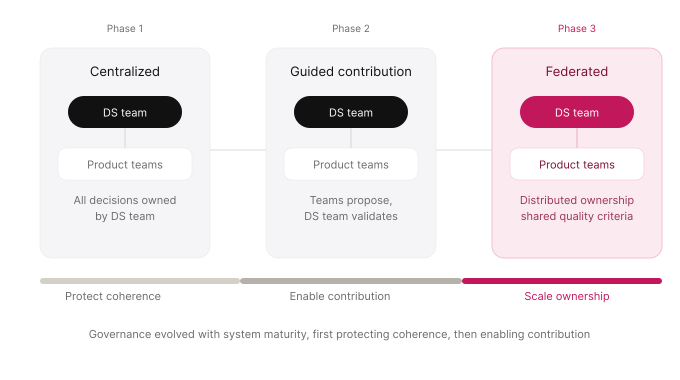
I centralised governance first, then federated it.
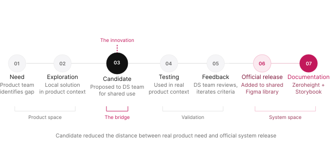
Early on we needed clear direction. Centralising protected coherence while the system settled, and it built the trust teams need before they adopt something new. But a fully centralised model turns the DS team into a bottleneck. As the system matured, we moved to a federated model: teams could propose, test and contribute, while the DS team held the quality bar. The Candidate workflow was the bridge between those two worlds: a clear path from a real product need to an official release, without rework or frustration.
I turned mobile resistance into planned adoption.
Bringing the system to mobile was the hardest decision. The app teams had their own design languages, years of work they had put in, and a completely fair fear of losing something that felt like theirs. Forcing it on them would have been a mistake. So would ignoring it. The strategy was different: months of conversations, workshops, sessions on benefits and risks, and an eight-month timeline so teams could plan the change at their own pace. We added iOS, Android and a third designer to the team. The win that mattered most was a change in how teams saw it, from "they're going to take our product away" to "we'll have a common base to move better and deliver one global experience."
| Decision | Rejected alternative | Trade-off | Why it mattered |
|---|---|---|---|
Foundations first Color · type · spacing · tokens | Build large component library early | Slower start | Components form a shared language, not isolated objects |
Semantic tokens Function over appearance | Visual naming (color-blue-500) | More naming effort | Reduces ambiguity across design and engineering |
Anatomy-based components Structure · states · slots | Appearance-driven design | Longer design phase | Flexibility without variant explosion |
Responsive grid as infrastructure Cultural + technical decision | Layout resolved per screen | Initial complexity | −60% effort in new features. LTR/RTL + A11y foundation |
Migration as refactorization Sketch → Figma | Treat as technical migration only | Higher effort upfront | Cultural inflection point for new habits and standards |
Centralize → federate Governance evolution | Open contribution from the start | Slower adoption early | Governance that outlasts the central team |
Candidate workflow Explore → test → release | Wait for official approval cycle | More process steps | Safer adoption, less rework, faster trust |
Mobile: progressive adoption 8-month horizon | Impose system or delay mobile entirely | Months of alignment work | Resistance converted into planned adoption across iOS and Android |
Each decision includes the alternative rejected and the cost accepted to get there
Governance
Centralise → federate:
governance that outlasts the central team.
Centralising protected coherence while the system settled, and it built the trust teams need before they adopt something new.
As the system matured, we moved to a federated model: teams could propose, test and contribute, while the DS team held the quality bar.
Candidate Workflow
The bridge between real product need and official release.
The Candidate workflow was the bridge between those two worlds: a clear path from a real product need to an official release, without rework or frustration.
This significantly reduced rework for designers who had built screens with components that would later change in the release, making contribution predictable.
OUTCOMES
The system was never just an idea on paper.
When these numbers were recorded, 39 components from the web library were in active use across 10 product modules, with 3,026 instances in total. HCP Client, the main clinical tool, accounted for 35 components and 1,738 instances on its own. These are web-library figures only; iOS, Android, icons and illustrations are not part of this dataset.
Components in active use
Web library · 10 product modules
Total instances recorded
Web library only · excluding iOS and Android
Effort reduction
In new features after the responsive grid
Mobile adoption horizon
Months for planned iOS/Android adoption
"In diabetes care, this is not a product detail. It is a condition for healthcare professionals to do their job well."